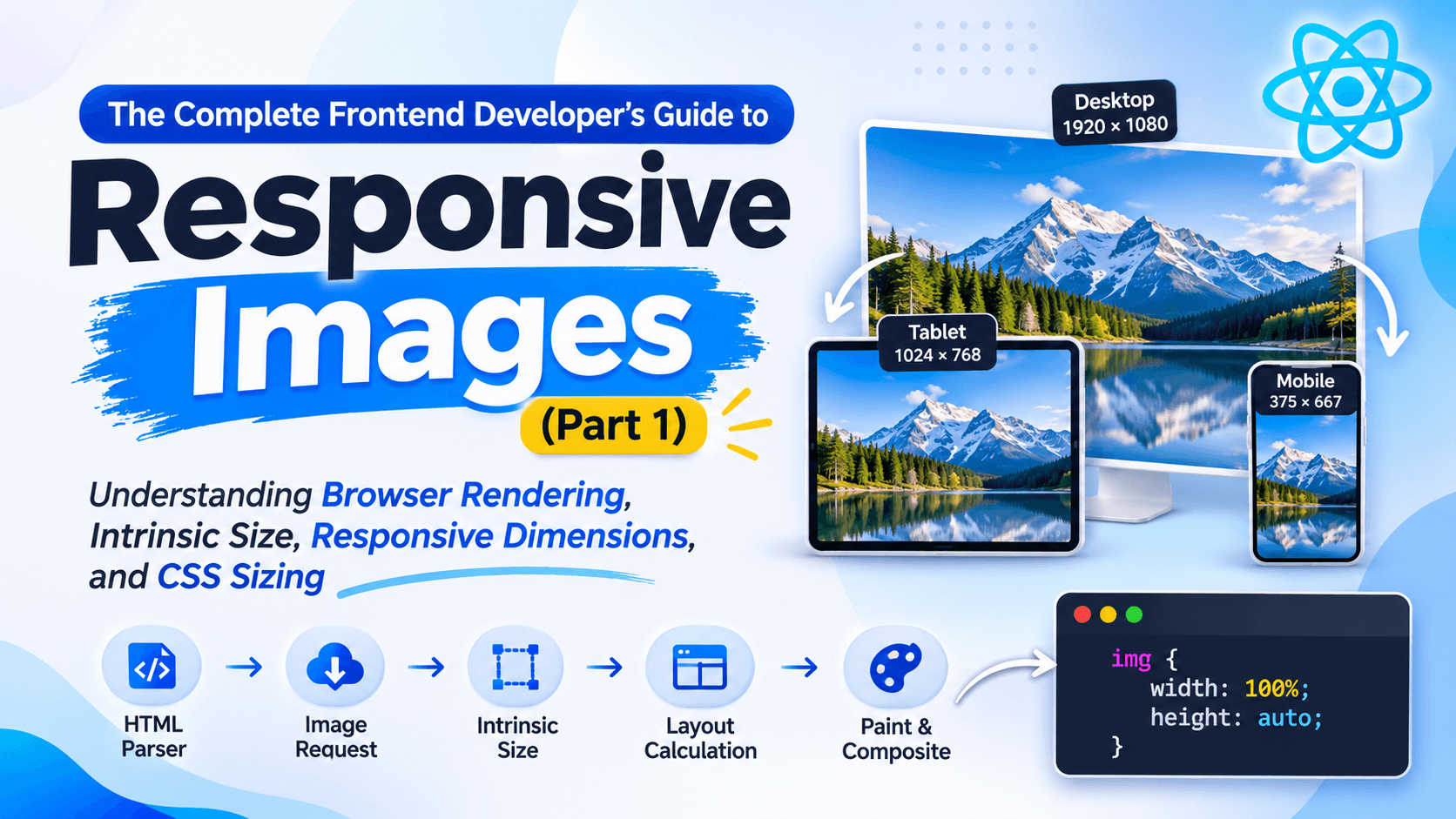
Understanding Browser Rendering, Intrinsic Size, Responsive Dimensions, and CSS Sizing
If you have worked on any website, you already know that images are usually the heaviest thing on the page. They affect almost every performance number that matters, like Largest Contentful Paint, Cumulative Layout Shift, total page load time, how much data the user is downloading, and even how Google ranks your site in search results.
Most developers, when they hear responsive images, immediately think of this one line of CSS.
img {
  width: 100%;
  height: auto;
}
This is a fine starting point, no doubt. But what actually happens inside the browser is much more than this one rule. The browser is calculating the natural size of the image, keeping the aspect ratio safe, reserving space in the layout, deciding which image file to load, and figuring out how this image should behave inside your layout, all before it even paints a single pixel on the screen.
Once you understand this process properly, you will start building pages that are not just responsive looking, but actually fast, stable, and nice to look at on any device.
In this article we will go through how browsers render an image step by step, what intrinsic sizing means, why the width and height attributes in HTML are so important, and how you can build layouts that perform well everywhere.
How Browsers Render an Image#
When the browser sees a tag like this,
<img src="hero.jpg" alt="Mountain">it does not just show the image straight away. There is a small process happening in the background. First the HTML parser creates a DOM node for it, then the browser requests the image file, reads its metadata, works out the intrinsic size, does the layout calculation, paints it, and finally composites it on the screen.
Now here is the interesting part. The browser tries to do the layout step even before the image has fully downloaded, wherever this is possible. How does it manage that? Simply because it tries to find out the dimensions of the image as early as it can. This is exactly why giving width and height attributes in your HTML is so useful, because it helps the browser plan the layout early.
Understanding Intrinsic Size#
Every image file already has a natural size built into it. Say your image, hero.jpg, is 1920 pixels wide and 1080 pixels tall. This is called the intrinsic size of that image.
Even before you write a single line of CSS, the browser already knows this image wants to be 1920 by 1080. You can think of it like the image is quietly telling the browser, if nobody else tells me otherwise, this is the size I want to be.
So for this image, the intrinsic width is 1920px, the intrinsic height is 1080px, and the intrinsic aspect ratio works out to 1920 divided by 1080, which is roughly 16 by 9. The browser keeps all three of these values in mind, and they become very important later when it is doing layout calculations.
CSS Size vs Intrinsic Size#
Take this simple example.
<img src="hero.jpg">Without any CSS, the browser will just show it at its intrinsic size, that is 1920 by 1080. Now let us add some CSS.
img {
  width: 400px;
}
Here the browser sets the width to 400px, and since we did not mention height, it stays as auto. Because height is auto, the browser will use the intrinsic ratio to work out the height on its own, and the image becomes 400 by 225. Nothing gets stretched or distorted here.
But now see what happens if we write this instead.
img {
  width: 400px;
  height: 400px;
}
In this case, the browser has no choice but to ignore the natural ratio of the image, and the picture gets stretched. This is exactly why setting fixed width and fixed height together is generally not a good idea, unless you actually want the distortion, or unless you are using object-fit to control it properly.
Controlling Cropping with object-fit
Sometimes you do want a fixed width and fixed height on an image — a square avatar, a uniform grid of product thumbnails, a card cover image that always fills the same box. The problem, as we just saw, is that fixed dimensions distort the image because the browser can't preserve the aspect ratio anymore. object-fit fixes this without giving up the fixed box.
img {
  width: 300px;
  height: 300px;
  object-fit: cover;
}
object-fit tells the browser how to fit the image's intrinsic content inside a box that no longer matches its natural ratio. The main values:
fill(default) — stretches the image to fill the box exactly, ignoring aspect ratio. This is what was happening before, and it's why the image looked distorted.cover— scales the image to fill the box completely while preserving aspect ratio, cropping whatever overflows. Best for avatars, thumbnails, and card covers.contain— scales the image to fit entirely inside the box while preserving aspect ratio, leaving empty space (letterboxing) if the ratios don't match. Best when you can't lose any part of the image.none— ignores the box size and shows the image at its natural size, cropped by the box if it's bigger.scale-down— behaves like none or contain, whichever results in a smaller image.
Pair it with object-position to control which part of the image stays visible when cropping:
img {
  width: 300px;
  height: 300px;
  object-fit: cover;
  object-position: top; /* keep the top of the image visible instead of the center */
}
So the rule of thumb becomes: use width: 100%; height: auto; when you want the image's own ratio to drive the layout, and use fixed dimensions with object-fit: cover when the layout needs a fixed shape and the image needs to adapt to it instead.
Why Width and Height HTML Attributes Matter#
A lot of developers assume that writing this, <img width="1920" height="1080"> means the image size is now fixed forever. That is not true at all. What these attributes are really doing is telling the browser to reserve space for an image whose aspect ratio is 16 by 9. The final rendered size is still fully controlled by your CSS.
<img
  src="hero.jpg"
  width="1920"
  height="1080"
alt="Hero Image">img {
width: 100%;
height: auto;
}Depending on how big the parent container is, this same image could end up being 350 by 197, or 720 by 405, or maybe even 1280 by 720. The HTML attributes are not fixing the size, they are only there to keep the ratio safe and correct.
Preventing Layout Shift#
Imagine your page has a header, then some empty space where an image is loading, then your article content, and then a footer. Since the browser does not yet know how tall this image is going to be, it cannot properly reserve the space for it.
Then suddenly the image finishes loading, and everything below it jumps downward because now there is a real image taking real space. This sudden jump is what we call Cumulative Layout Shift, or CLS. Users really do not like this kind of jumpy experience, and Google actually penalizes pages for this in search rankings.
Now compare this with the same image having proper attributes.
<img src="hero.jpg" width="1920" height="1080">Even before the image has finished downloading, the browser already knows the ratio is 16 by 9, so it reserves the correct amount of space right from the start. Nothing jumps around, and the layout stays stable throughout the loading process.
CSS Width#
The width property basically tells the browser how much horizontal space your image should take up.
img {
width: 300px;
}This is simple enough to understand, but fixed pixel widths like this rarely work well once you start dealing with responsive layouts. That is why we usually prefer writing something like this instead.
img {
width: 100%;
}Now the image will always fill up its parent container completely. If the parent is 400px wide, the image becomes 400px. If the parent grows to 900px, the image grows along with it to 900px.
width 100 percent vs max width 100 percent#
This is one topic that confuses a lot of people, even experienced developers sometimes get this wrong.
When you write width 100 percent, the image will always fill its parent container completely, even if the actual image file is smaller than that container. So say your image is only 300px wide naturally, but the container is 900px, the browser will stretch it up to fill the full 900px, and because of this stretching the image quality can drop noticeably.
But when you write max width 100 percent instead, the image will never grow bigger than its own natural width. So in the same example, a 300px image inside a 900px container will simply stay at 300px, and it will not get blown up. This second approach is usually much safer for normal content images on your website.
Why height auto Is So Important#
Take this example.
img {
  width: 100%;
  height: auto;
}Here the browser is doing a small calculation behind the scenes. It works out the new height by taking the new width, dividing it by the intrinsic width, and multiplying that by the intrinsic height. So if your image is naturally 1200 by 800, and its container is 600px wide, the final result becomes 600 by 400, and the original ratio stays perfectly preserved.
What Happens When Height Is 100 Percent#
A common mistake beginners make is writing something like this.
img {
width: 100%;
height: 100%;
}Sometimes this seems to work fine, and sometimes it completely breaks the layout. The reason is that height 100 percent simply means take 100 percent of whatever height the parent element has. But if the parent itself does not have any explicit height set, and it is also relying on auto, then there is nothing for the browser to calculate 100 percent of, and you end up with unexpected results in your layout.
Understanding the Image Sizing Algorithm#
Roughly speaking, this is the logic modern browsers follow when they size an image. First they check if there is a CSS width mentioned, and if yes, they calculate the width based on that. Then they check if there is a CSS height mentioned. If height is explicitly given, that value gets used directly. But if height is set to auto, the browser falls back on the intrinsic ratio of the image to figure out the correct height automatically.
This is exactly the reason why the combination of width 100 percent along with height auto works so reliably well in real projects.
Responsive Dimensions#
Responsive design really means that your image should adapt based on the space actually available to it inside the layout, not simply based on the screen size or the viewport width. For example, the same image might need to display well inside a 1200px wide space on desktop, a 700px space on tablet, and a 360px space on mobile.
This is exactly why we generally prefer percentage based widths over fixed pixel values, because percentages naturally scale with whatever space is given to them.
Images Inside Flexbox#
Consider a simple card component like this.
<div class="card">
<img src="cover.jpg" alt="Cover">
</div>.card {
display: flex;
}Sometimes developers notice that the image is overflowing out of its container, and this happens more often than people expect. The reason behind this is that flex items have a default min width set to auto, which can stop the image from shrinking properly. To fix this kind of issue, you can allow the image or the card itself to shrink like this.
.card img {
width: 100%;
height: auto;
}
.card {
min-width: 0;
}This one small rule ends up fixing a lot of confusing overflow problems that show up in flex layouts.
Images Inside CSS Grid#
Grid behaves in a fairly similar way to flexbox here.
.grid {
display: grid;
grid-template-columns: repeat(auto-fit, minmax(250px, 1fr));
}For the images placed inside grid cells, you would usually write this.
img {
  width: 100%;
  height: auto;
}Each grid cell is responsible for controlling its own width, and the image inside it simply follows whatever width the cell gives it.
Responsive Containers#
Instead of controlling the image directly with fixed sizes, most modern layouts prefer to control the container around it, and let the image simply follow.
.card {
  max-width: 500px;
}

.card img {
  width: 100%;
  height: auto;
}
This kind of separation makes your components much easier to reuse across the project. The card takes care of deciding its own size, and the image just fills up whatever space the card gives it.
Choosing Between Fixed, Fluid, and Responsive Images#
There are basically three approaches you can take. A fixed width, like width 400px, works well for things like icons and logos, but it is not suitable for responsive layouts at all. A fluid width, like width 100 percent, fills up the available space nicely and works well for most components on a page. And then there is the responsive approach, where you combine width 100 percent with a max width, say 800px, along with height auto. This last option scales naturally while still respecting an upper limit, and honestly this is usually the best solution for most real world projects.
A Real World Example#
Let us look at a small blog card as an actual example.
<article class="card">
  <img
    src="cover.jpg"
    width="1200"
    height="800"
    alt="Article Cover">
  <h2>Responsive Images</h2>
  <p>Some article content goes here.</p>
</article>.card {
max-width: 420px;
}
.card img {
width: 100%;
height: auto;
display: block;
}Why does this particular setup work so well? Because the browser already knows the aspect ratio of the image before it even finishes downloading. The card is the one controlling the overall layout. The image simply scales along with the card. There is no distortion happening anywhere. Layout shift is completely avoided, and this same card will look good on desktop, tablet, and mobile without any extra work.
Common Mistakes#
There are a few mistakes that keep showing up again and again in real codebases. Using fixed width and fixed height together, like width 600px and height 400px, makes your image completely non responsive. Forgetting to add height auto is sometimes harmless because height already defaults to auto anyway, but writing it out explicitly makes your intention clear to anyone reading the code later. Setting both width and height to 100 percent without using object-fit usually ends up stretching and distorting the image. Leaving out the width and height attributes from your HTML altogether forces the browser to wait longer before it can calculate the layout, which increases the chances of layout shift. And finally, using a small image, say 300px wide, inside a much bigger container, say 800px, will make it look blurry and stretched, so you should always try to provide an image that actually matches the size it will be displayed at.
Best Practices Checklist#
Before you ship any image to production, it is worth quickly checking a few things. Does your image have proper width and height attributes written in the HTML. Is your CSS responsive, meaning are you using width 100 percent or max width 100 percent. Is height allowed to scale on its own using auto. Will the image keep its original aspect ratio intact. Could this particular image cause any layout shift before it fully loads. Is the image being unnecessarily stretched or upscaled beyond its natural size. And is the container the one responsible for the overall layout, while the image itself is just adapting to it. If you can honestly say yes to most of these points, you are already doing better than a lot of production codebases out there.
Conclusion#
Responsive images are honestly a lot more than just one line of CSS. They come from proper collaboration between your HTML, your CSS, the browser's rendering engine, and the intrinsic metadata already present inside the image file itself.
Once you get a proper grip on ideas like intrinsic dimensions, aspect ratios, HTML sizing attributes, and responsive CSS sizing, you will stop treating images as just static files sitting on your page, and start treating them as proper first class citizens of your overall layout system.
This understanding does not just make your interface look nicer either. It directly improves your Core Web Vitals, makes your site more accessible, reduces layout instability, and gives every single user a faster experience overall.
In Part 2, we will build further on this same foundation and go into modern responsive image techniques such as srcset, sizes, the picture element, AVIF and WebP formats, lazy loading, fetchpriority, handling Retina displays properly, and image optimization strategies that are actually used in production applications today.